I decided yesterday that the institutional white walls of my office were getting to me and something needed to be done sooner rather than later. So last night I went a little crazy with my colour printer and printed off a slew of pictures in sizes from 3x5 to 8x10. Everything from images taken off the net to photos from my digital camera ... and then I went and bought some self-adhering hooks and finally hung my Crouching Tiger poster, which I was waiting to have done for me (having discovered the hard way that my walls are quite nail resistant). But the wheels of, well, everything run pretty slowly here and I was despairing of ever seeing it on the wall.
So the poster is up, and I have a ton of pictures that I've arranged, tetris-like, over my desk and over the computer. Now, there's a very careful semiotics of office decor in universities, especially what you put on your door. It's all about what kind of professor you think you are. Do I want to seem esoteric? avant-garde? a renaissance man? Do I want my pictures on display to reflect my wholehearted immersion in my relatively narrow field of study, or do I want to convey the impression that I have a very broad range of interests? Do I put up images from pop culture to eschew scholarly pretension? or do I go with a spartan office and blank door to make people think I'm simply too busy to be concerned with such trivialities? (of course, there really are some profs who are simply too busy and preoccupied with their research to be concerned with such trivialities, but they tend to be looked on as vaguely freakish).
So the poster is up, and I have a ton of pictures that I've arranged, tetris-like, over my desk and over the computer. Now, there's a very careful semiotics of office decor in universities, especially what you put on your door. It's all about what kind of professor you think you are. Do I want to seem esoteric? avant-garde? a renaissance man? Do I want my pictures on display to reflect my wholehearted immersion in my relatively narrow field of study, or do I want to convey the impression that I have a very broad range of interests? Do I put up images from pop culture to eschew scholarly pretension? or do I go with a spartan office and blank door to make people think I'm simply too busy to be concerned with such trivialities? (of course, there really are some profs who are simply too busy and preoccupied with their research to be concerned with such trivialities, but they tend to be looked on as vaguely freakish).
So what is the semiotics of my office? You judge. A random sampling of my new decor:

Movies -- carefully balanced between the artistic ...

... and the silly.

The boys ...

... and the Man ...

Memories.

The good doctor.

Narf!
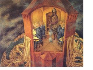 And of course, some relatively obscure but topical art to give people the impression that I know more about painting and art history than I do. This painting is "Bordando el Manto Terrestre" (always be sure to mention the title in the original language), or "Embroidering the Earth's Mantle," by Remedios Varo. Significant because it is mentioned in Thomas Pynchon's The Crying of Lot 49.
Coming soon in a future post: Chris' Academic Survival Guide, or How To Sound Smarter and More Well-Read Than You Are.

3 comments:
Very nice. Art is always a good choice ,isn't it?
Angelika
the army of darkness poster can serve as a litmus test for your students. if they mention it, bonus marks. if they dont, call them a primitive screw-head and get out the boom-stick.
Heyhey! I haven't commented in a while due to moving back to London, so this comment is late-coming. Nonetheless, I wanted to contribute to the decor commenting. I especially like the Pinky and the Brain one. Good choice!
Post a Comment